Control Charts are an important tool for analyzing your process. In this post I show you how you can create a lead time Control Chart in Microsoft Excel 2010.
Important note
In this example the control limits are based on the standard deviation function in Excel. This may or may not be the correct way to calculate your control limits of your data
Let’s get started.
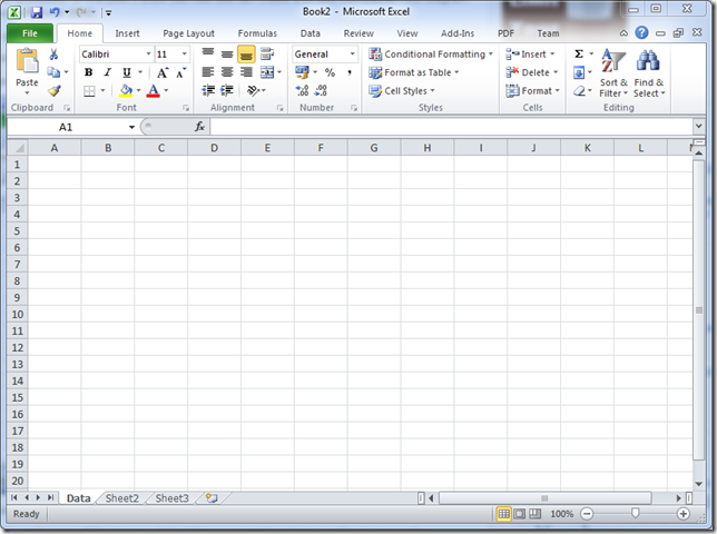
1. Create a new workbook
2. Rename “Sheet1” to “Data”
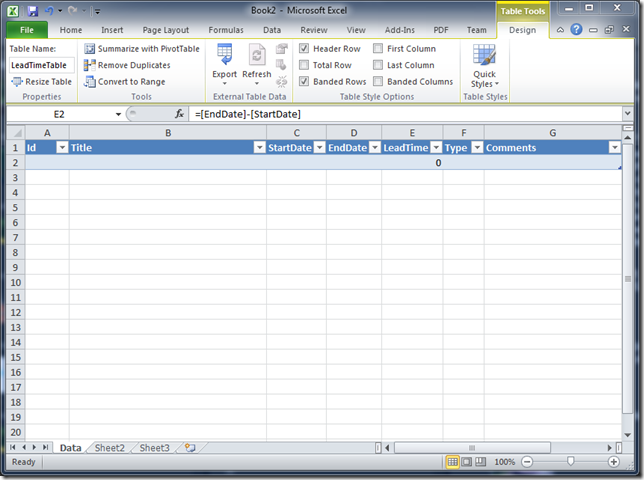
3. Add the columns “Id” , ”Title”, “StartDate”, “EndDate”, “LeadTime”, “Type”, “Comments”
4. Select all the columns and the row below
5. Open the “Insert tab” in the Excel ribbon
6. Create a table by clicking on the “Table” button on the Excel ribbon
7. Check “My table has headers” and click OK
8. Rename table to “LeadTimeTable”
9. Format the header row to make more useable
10. Format the columns “StartDate” and “EndDate” as date columns
12. Add the formula “=[EndDate]-[StartDate]” in the “LeadTime” column
12. Format the “LeadTime” column as number column
13. Add some example data
14. Switch to the “Sheet2” worksheet and rename it to “Criterias”
Now we will create criteria’s that will be used to select the appropriate rows from the “LeadTimeTable” on the “Data” sheet when we do the calculations for the control chart.
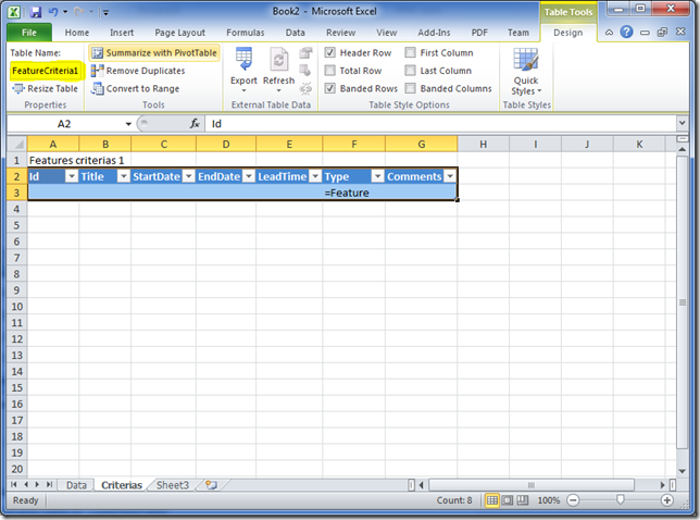
15. Add a label for your criteria and add it to the “Criterias” sheet
16. Copy the header row form the “Data” sheet as shown
17. Add the criteria to get all features by adding the formula =”=Feature” in the feature column
18. Select the all the headers and the criteria row below
19. Open the “Insert tab” in the Excel ribbon
20. Create a table by clicking on the “Table” button on the Excel ribbon
21. Check “My table has headers” and click OK
22. Rename table to “FeatureCriteria1”
23. Switch to the “Sheet3” worksheet and rename it to “Features”
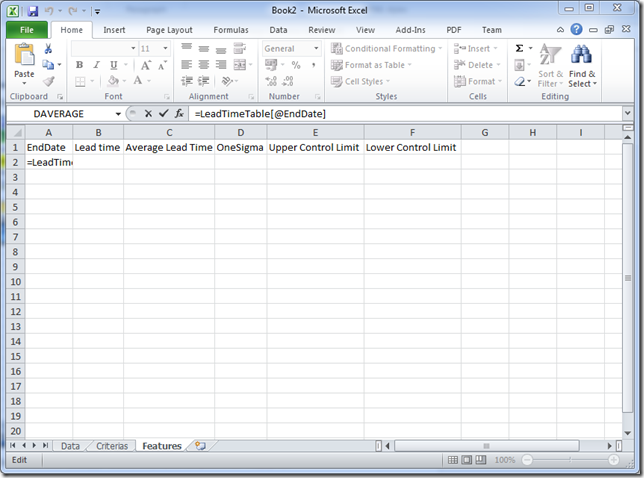
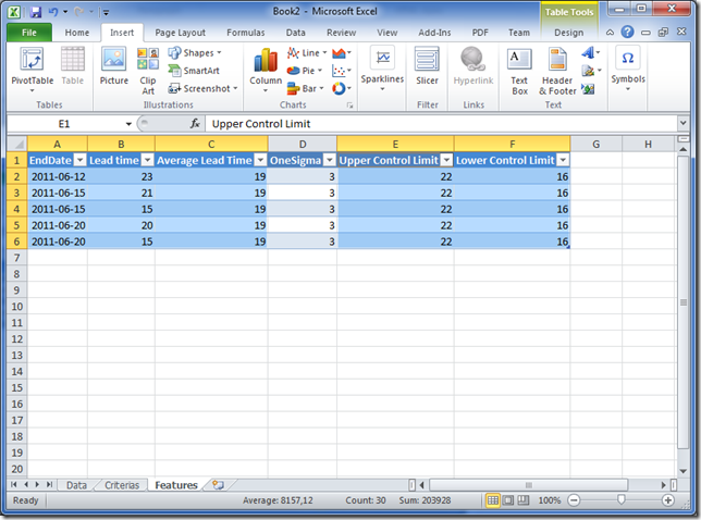
24. Add the columns “EndDate”, “Lead time”, “Average Lead Time”, “OneSigma”, “Upper Control Limit”, “Lower Control Limit”
25. In the “EndDate” column add the formula =LeadTimeTable[@EndDate]
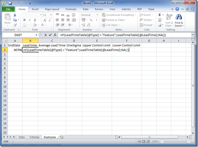
26. In the “Lead time” column add the formula =IF(LeadTimeTable[@Type] = “Feature”;LeadTimeTable[@LeadTime];NA())
This formula will get the “Lead time” if the type is a feature and sets a #N/A if not. This will prevent non feature values to be plotted on the control chart.
27. In the “Average lead time” column add a DAVERAGE formula as shown
This formula will calculate the average lead time for all rows matching the “FeatureCritera1”
28. In the “OneSigma” column add a DSTDEVP formula as shown
This formula will calculate the standard deviation for the lead time of the population matching the “FeatureCritera1”
29. In the “Upper Control Limit” column add the formula =C2+D2
This formula adds one sigma or one confidence interval to the average lead time. This will be the upper control limit that is approximately 70% of the population.
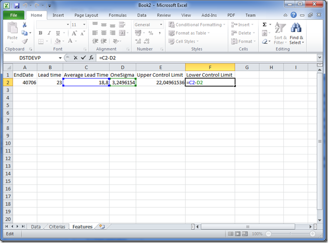
30. In the “Lower Control Limit” column add the formula =C2-D2
This formula subtracts one sigma or one confidence interval from the average lead time.
31. Format the columns to make it more usable
32. Select all the columns and the row with the formulas
33 Open the “Insert tab” in the Excel ribbon
34. Create a table by clicking on the “Table” button on the Excel ribbon
35. Check “My table has headers” and click OK
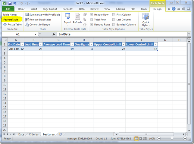
36. Rename table to “FeatureTable”
37. Now expand the “FeatureTable” to the same row count as in the “LeadTimeTable”
We are now ready to create the Feature Lead Time Control Chart.
38. Select all but the “OneSigma” column
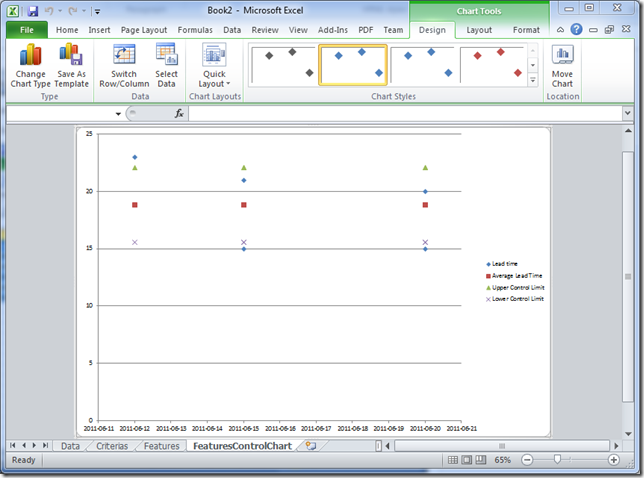
39. Insert a “Scatter with only Marker” chart and move it to a new sheet named “FeaturesControlChart”
40. Select the “Average Lead Time” series by selecting one of its markers
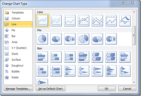
41. Right click and select “Change Series Chart Type”
42. Select a “Line” chart
43. Now repeat step 31 to 33 for “Upper Control Limit” and “Lower Control Limit”
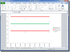
The chart should now look something like this
44. Now format the chart to make it clear what is inside the control limits. It could look something like this
Done!
Now you have a lead time control chart! Now you can replace the example data and add your own data. Just add a new row for every delivered feature. Remember to also update number of rows of the “FeatureTable” (see step 28) or the cart will not be updated correctly.
You can also add other work item types and other criteria’s for the calculations as you use it.
Download example file here: Control Chart Example.xlsx










hey there, i tried to follow ur guidelines here but it seems like i am having trouble with formula in number 17 ‘s instruction(lead time table for sheet3). FYI, i don’t have much knowledge when it comes to excel. So dealing with formulas is such troublesome.when i pressed enter,this warning popped out :
“the formula u typed contains an error”
could u please help me solve this?
Hi,
Can you post what you are trying to enter as the formula as a new comment.
When you use a formula in Excel it starts with a = sign. In this case you have to enter the = for the formula and the add “=Feature” so the full result would be =”=Feature”
/Håkan
Hi, I had the same problem.
Firstly, make sure your column headers in preceding worksheets match: “Lead Time” will not work; “LeadTime” will
Secondly, the formula stated above is slightly different from the one in the example file.
Change:
=IF(LeadTimeTable[@Type] = “Feature”;LeadTimeTable[@LeadTime];NA())
To:
=IF(LeadTimeTable[@Type] = “Feature”,LeadTimeTable[@LeadTime],NA())
Hope that helps,
David
This is awesome, thanks very much. I’ve managed to construct one using my own data just by following your instructions.
What I would also like to know is how to add calculation points. So… I want to see how the average lead time and upper / lower control limits change over time (e.g. monthly) rather than an average for a whole year.
Do you know how I can go about adding that?
Ha! Trying myself… when I have you so nearby. Great post!
@najilaa (or anyone else that receives the error), try changing the semicolons to commas.
=IF(LeadTimeTable[@Type]=”Feature”,LeadTimeTable[@LeadTime],NA())
@PBarba…I did exactly what you said, and I have tried many changes but I still receive the error…..
Thanks for sharing, Håkan!
You saved me countless hours of Excell try-and-errors to get a decent Control Chart. I did experience some problems (I do not have the same version) but succeeded to make it work in the end.
Great!
I was unable to download the attached example. I believe my company has blocked it. Please forward a copy by email if you do not mind. Thank you.
I am held up on Step 18. I have entered:
=DAVERAGE[LeadTimeTable[#All],”[[#Headers];[LeadTime]]”,FeatureCriteria1[#All]
My list separator is set to comma (,) instead of to semi-colon. But, either way, this formula does not work for me.
Please contact Doug in York PA if you do not mind. (Thanks).
Hi Douglas,
I think the problem is the is the separator. Please try this formula and see if it works:
=DAVERAGE(LeadTimeTable[#All],LeadTimeTable[[#Headers],[LeadTime]],FeatureCriteria1[#All])
No, that did not work either. Thanks anyway. What did work was: =DAVERAGE(LeadTimeTable[#All],”LeadTime”,FeatureCriteria1[#All]) . All the field position of the function wanted was the title of the LeadTime field expressed simply. I discovered this by looking up the DAVERAGE function to see what it was asking.
Awesome. Thanks.
Hey Douglas Eckert ,
To end your problem I can suggest something.
You need to understand the formula and not blindly copy paste the formula: Here is the solution:
1) In the Data base tab of DAVERAGE formula table you need to select all the data points available in the first sheet Tab called Data.
2) In the field Tab of DAVERAGE formula table you need to select the heading field called LeadTime (B1) in the third sheet Tab called Features.
3) In the Criteria tab of DAVERAGE formula table you need to select all the data points available in the second sheet Tab called Criterias.
Same you need to repeat for the DSTDEVP formula too.
Hope this will help u
Dear Santanu: Step 17 of the example is a problem, for some reason¨=IF(LeadTimeTable[@Type] = “Feature”;LeadTimeTable[@LeadTime];NA())
I am working offline for now, by the way.
Doug in York PA
And, now I am back online…
Doug in York PA
I do not remember much about this conversation at this late date. But, in reviewing my example I noticed the criteria for an “out-of-control” process refers to three zones on the chart – A, B and C. What are these zones?
Thanks so much for the step by step instructions! I spent the day creating one and understanding how it works etc for my team. I took the time and even converted it to a Google Spread Sheet. Feel free to take a look, copy it, and use it!
https://docs.google.com/spreadsheet/ccc?key=0AqWHu14u074CdENENnNJaktQTXprelJKVTNDMFdUWFE&usp=sharing
I’ve been messing around with trying to add different types of work. Being a novice at Excel any clue how to do this?
The column [Type] together with the use of criteria(see step 14-22) can be used to plot different work types.
Thanks for the reply. I really appreciate it and the work you’ve done with the spreadsheets. 🙂
I’m assuming one would also have to create a new sheet for other types of work that are not “Feature” work (eg “Defect”) and then create a chart based off that new type of work/sheet, correct?
Thank you so very much Hakan !! This was really very helpful..
Cheers,
Rawlin